
Best AI Tools for Web Designers and Developers in 2026
Artificial intelligence is changing the way websites are designed, developed, and maintained. Tasks that once required hours of brainstorming,…
A great website should work for everyone. Whether visitors use a desktop computer, smartphone, keyboard, screen reader, or other assistive technology, they should be able to access information and use website features comfortably.
Website accessibility is an essential part of modern web design. It helps create inclusive digital experiences, improves usability, and makes websites easier to navigate for people with different abilities and needs.
In this guide, we’ll explore 12 website accessibility best practices in 2026, including readable typography, keyboard navigation, image descriptions, color contrast, accessible forms, and responsive design.
Website accessibility means designing and developing websites so that people with disabilities can perceive, understand, navigate, and interact with digital content.
Accessibility considers different user needs, including people with:
Accessible design also benefits people using slow internet connections, small screens, older devices, or websites in challenging environments.
The Web Content Accessibility Guidelines (WCAG) provide internationally recognized recommendations for making web content more accessible.
Website accessibility is about more than compliance. It helps create better experiences for a wider audience.
Some important benefits include:
Accessibility does not guarantee higher search rankings, but it supports many good web development practices.
Headings organize website content into meaningful sections. They help visitors understand the page and allow screen reader users to navigate content more efficiently.
Use headings in a logical order:
Avoid choosing heading levels only because of their visual appearance. Use CSS to control heading size and style instead.
A well-structured page makes information easier to scan and understand.
Alternative text, commonly called alt text, describes meaningful images for people who cannot see them.
For example, instead of using:
image123.jpg
Use descriptive alternative text such as:
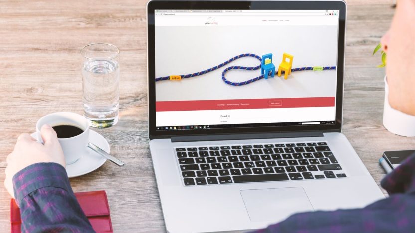
A web designer creating a responsive website on a laptop
Good alt text should explain the image’s purpose or relevant content.
Decorative images that provide no meaningful information should generally use an empty alt attribute so screen readers can skip them.
Avoid stuffing keywords into image descriptions. Accuracy and usefulness should come first.
Text should be easy to read against its background.
Low-contrast combinations can make information difficult to understand, especially for people with visual impairments or color vision deficiencies.
For normal-sized text, WCAG 2.2 Level AA generally recommends a contrast ratio of at least 4.5:1. Large text generally requires at least 3:1.
For better readability:
Not everyone uses a mouse or touchscreen. Some visitors navigate websites entirely with a keyboard.
Make sure users can:
A visible focus indicator is especially important because it shows users where they are on the page.
Links should explain where they lead.
Instead of using vague phrases such as “Click here” or “Read more,” use descriptive link text that communicates the destination.
For example:
Descriptive links help visitors understand their options, including people navigating through a screen reader’s links list.
Forms are essential for contact pages, registrations, subscriptions, and other website interactions.
An accessible form should include:
Do not rely on placeholder text as the only label. Labels should remain available when users enter information.
If a form contains errors, explain what went wrong and how the visitor can correct it.
Typography affects how comfortably visitors can read your content.
Choose fonts that are clear and suitable for your website’s audience.
Follow these recommendations:
Good typography improves readability and makes your website feel more professional.
Visitors should be able to understand your website’s navigation without unnecessary effort.
Use clear menu labels such as Home, About, Services, Blog, and Contact.
Keep navigation consistent across pages. On mobile devices, ensure that menus can be opened, navigated, and closed using both touch and keyboard controls.
Provide a clear indication of the current page where appropriate.
Avoid complicated menu structures that make important information difficult to find.
Videos and audio content can exclude visitors when important information is available in only one format.
Consider providing:
Captions should accurately represent spoken dialogue and meaningful sounds.
These alternatives help people with hearing impairments and visitors who cannot play audio in their current environment.
An accessible website should work across different screen sizes and devices.
Responsive design helps visitors use your website on smartphones, tablets, laptops, and desktop computers.
Test your website at different viewport widths and check that:
Responsive design and accessibility should be considered together rather than treated as separate tasks.
Animations can make a website visually engaging, but excessive motion may create problems for some visitors.
Provide ways to reduce or disable nonessential motion. Respect the user’s operating-system preference for reduced motion where possible.
Avoid rapidly flashing content, unexpected autoplay, and distracting effects.
Use animations to support the experience, not to prevent visitors from understanding or using the website.
Accessibility should be part of your ongoing website maintenance process.
You can combine automated tools with manual testing.
Useful tools include:
Automated tools cannot identify every accessibility issue. Manual testing with real assistive technologies and, where possible, feedback from people with disabilities is also important.
Use this checklist when reviewing your website:
Website accessibility is the practice of making websites usable by people with different abilities, including people who use assistive technologies.
WCAG stands for Web Content Accessibility Guidelines. These guidelines explain how to make web content more accessible and provide criteria for evaluating accessibility.
Accessibility is not a direct guarantee of higher search rankings. However, meaningful headings, descriptive links, useful image text, and clear content structure can support both usability and search engine understanding.
Yes. You can improve WordPress accessibility by choosing an accessible theme, using semantic content structures, labeling forms, writing useful alt text, and testing your plugins and interactive features.
Start with keyboard navigation and an automated tool such as WAVE or Lighthouse. Then test important pages with a screen reader and review any problems manually.
Accessibility requirements depend on your country, industry, audience, and applicable laws. WCAG is a widely used technical reference, but you should check the legal requirements relevant to your website.
Website accessibility is an important part of responsible and modern web design. By improving navigation, typography, color contrast, forms, images, and keyboard support, you can create digital experiences that work for more people.
Accessibility is not a one-time task. It requires regular testing, thoughtful design decisions, and continuous improvements.
Whether you’re building a personal portfolio, business website, blog, or online store, make accessibility part of your development process from the beginning.
A better website is not just visually attractive. It should be understandable, usable, and welcoming to everyone.